Page icon, cover, width and outline | Rodeo Docs
An icon, a cover image and the right width turn a page from a document into a place, and the outline gives long pages a table of contents that builds itself.
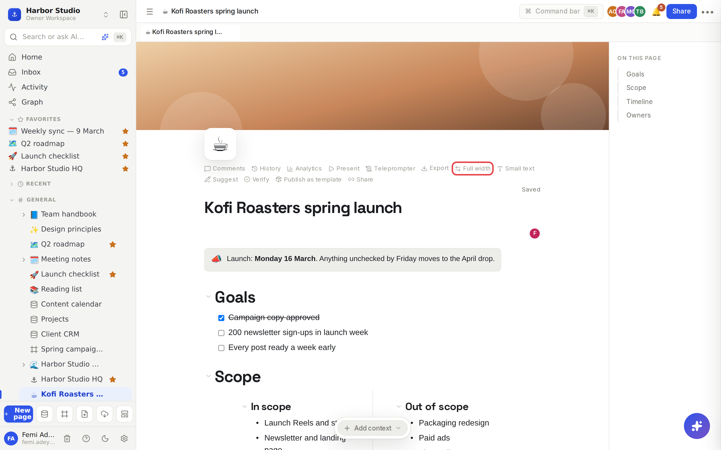
Do it
The page's own controls sit just above its title and appear when you hover the title area.
Add an icon
Hover the title and click Add icon.
Pick an emoji. It shows beside the page in the sidebar, in tabs, in search and wherever the page is mentioned.
To change it, click the icon.
Add a cover
Hover the title and click Add cover.
Choose an image from your computer. Rodeo uploads it and stretches it across the top of the page.
To swap it, hover the cover and click Change cover.
Choose the width and text size
Full width lets the page use the whole window instead of a comfortable reading column. Good for wide tables, boards and columns. Click it again to go back.
Small text makes the body text a little smaller, so more fits on screen.
Both are saved with the page, so everyone sees it the same way.
Use the outline
As soon as a page has a heading, an On this page list appears on its right, built from the page's headings. Click one to jump to it. Heading 2 and smaller are indented under their section.
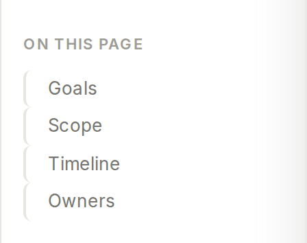
The outline updates as you type, so a new heading appears there straight away.
Tips and limits
Cover images must be PNG, JPEG, GIF or WebP, up to 10 MB.
Headings inside columns, toggles or callouts don't appear in the outline; only headings directly on the page do.
Icons come from a picker of 40 common emoji.
The outline shows on wider windows only. On a narrow window, and in the side panel that opens pages from links, it's hidden to leave room for the page.
Database rows opened as pages have an icon and cover too, but no Full width or Small text buttons.
Only editors see the controls. People who can only view the page see the icon, cover and outline, but not Add icon, Add cover, Full width or Small text.
The other header actions have their own pages: Comments, Version history, Page analytics, Present and teleprompter and Sharing and access requests.
Page layout works the same on every plan.
Ideas
A recognisable home for every client. Give each client page their brand colour as a cover and an icon (☕ for Kofi Roasters), so they're easy to spot in the sidebar and in search.
A long handbook people can navigate. Break the expense policy into Heading 2 sections, and the outline becomes its table of contents, no maintenance needed.
A wide planning page. Turn on Full width for the content plan so its database view and three columns have room to breathe. See Table view.